Brand identity for a national UK charity.
Previously named PACE (Parents Against Child Exploitation), Ivison Trust is a national charity working to keep children safe from exploitation by supporting their parents, disrupting the offenders and working in partnership with police and family services. They also train professionals through a national programme to support affected children and their parents using a trauma-informed, family-centric approach.
Design Project were commissioned by the charity to help them through the process of changing their name and to create a new brand identity design, following consultations with staff, supporters and beneficiaries, when it was discovered that their existing approach was becoming a barrier and holding the organisation back.
CLIENT:
Ivison Trust
SCOPE:
- Brand strategy
- Brand naming
- Brand identity
- Brand positioning
- Brand guidelines
- Print design
- Digital campaign
Brand naming and strategy:
Having operated under different names throughout their history, the charity identified the importance of honouring their founder, Irene Ivison, and were keen to explore this aspect as a possible new approach for their brand naming. Their previous names had taken the form of acronyms, which although highlighted their cause, did not speak inclusively enough regarding their support of all care givers, nor effectively represent the fight of the charity to improve the systems that exist to protect children from exploitation.
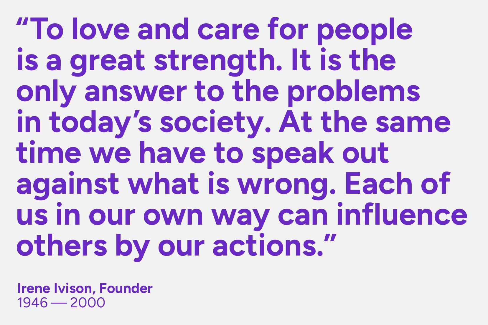
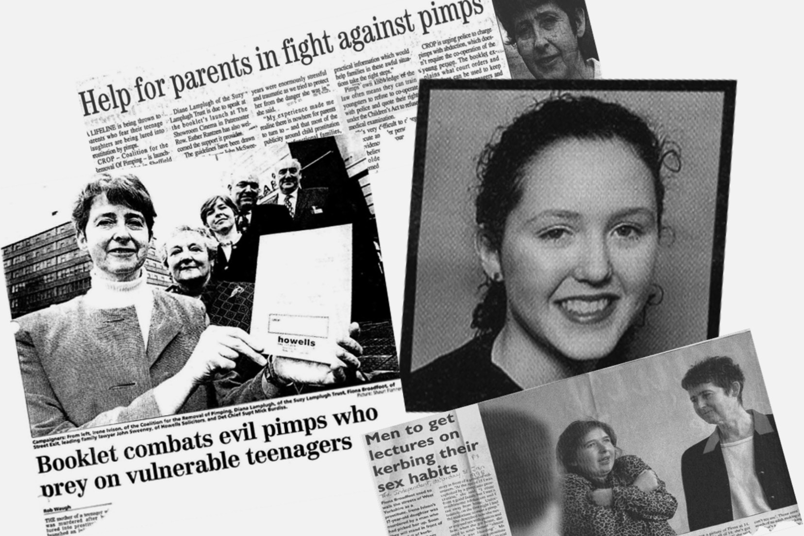
The story of the charity began with their pioneering founder, following the tragic loss of her own daughter. Irene started fighting for the rights of other parents who’s children were being exploited after the person responsible for her daughter’s murder was convicted, while those accountable for her exploitation failed to be prosecuted.
Brand identity design:
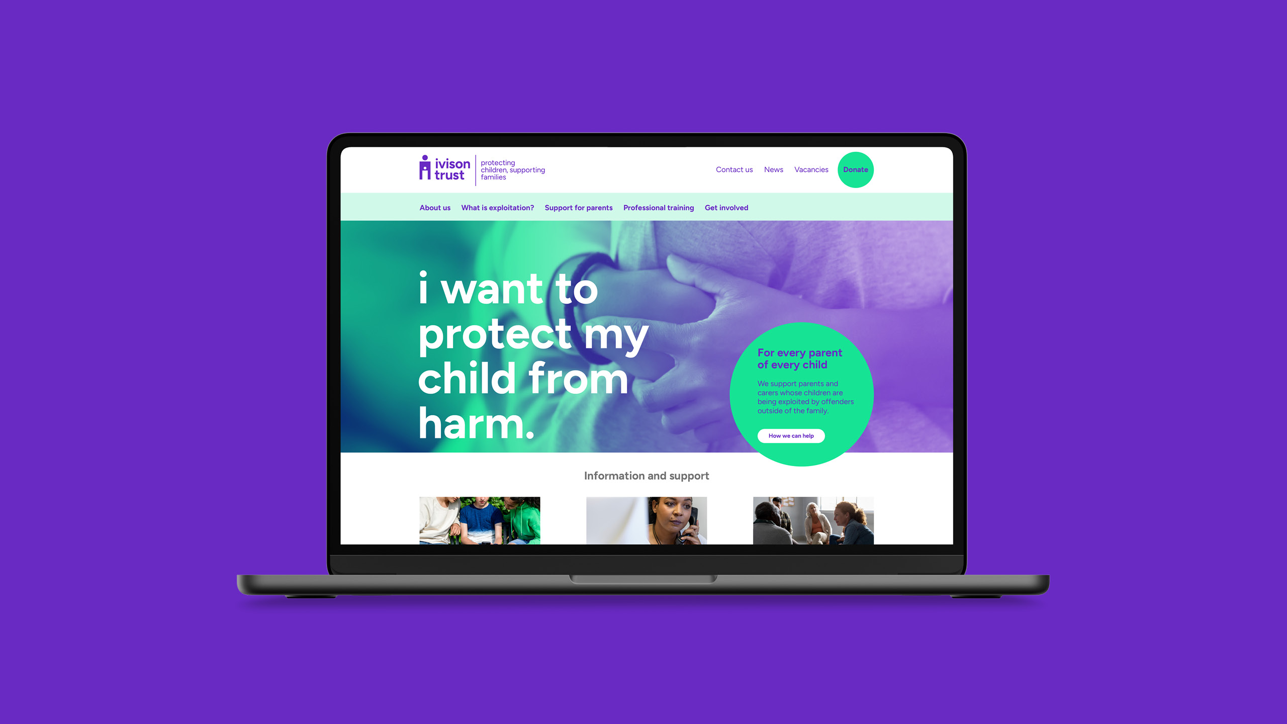
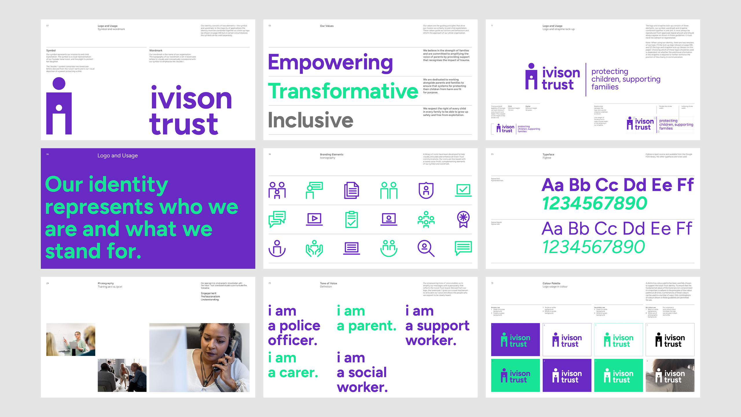
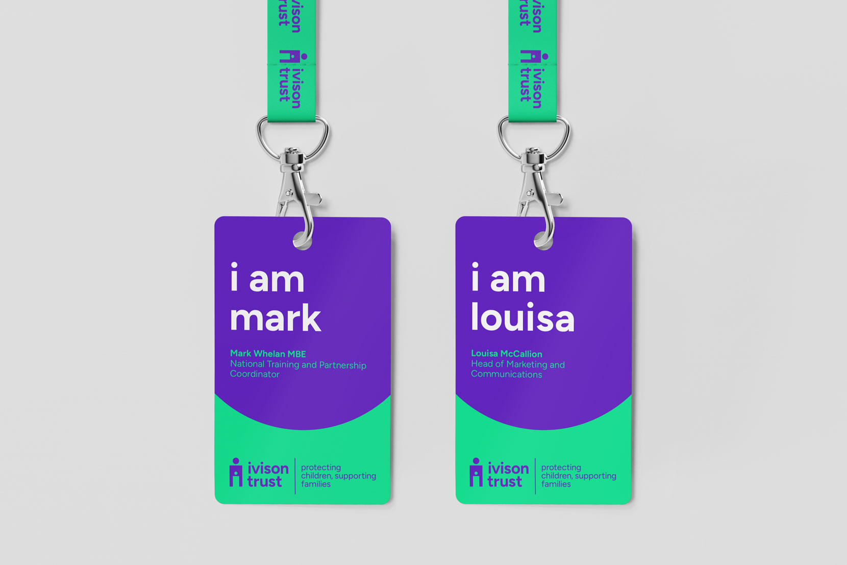
The charity proposed a number of brand naming options focussed on their founder which Design Project explored, along with a number of other approaches. Following initial development, we focussed on ‘Ivison Trust’, as this particular brand naming concept enabled us to honour the memory of Irene and her daughter as well as articulate their story through the logo design. By creating a ‘double i’ monogram / symbol from the matching letters in the name we were able to succinctly place the visual concept of universal parent-child protection at the heart of the brand logo.
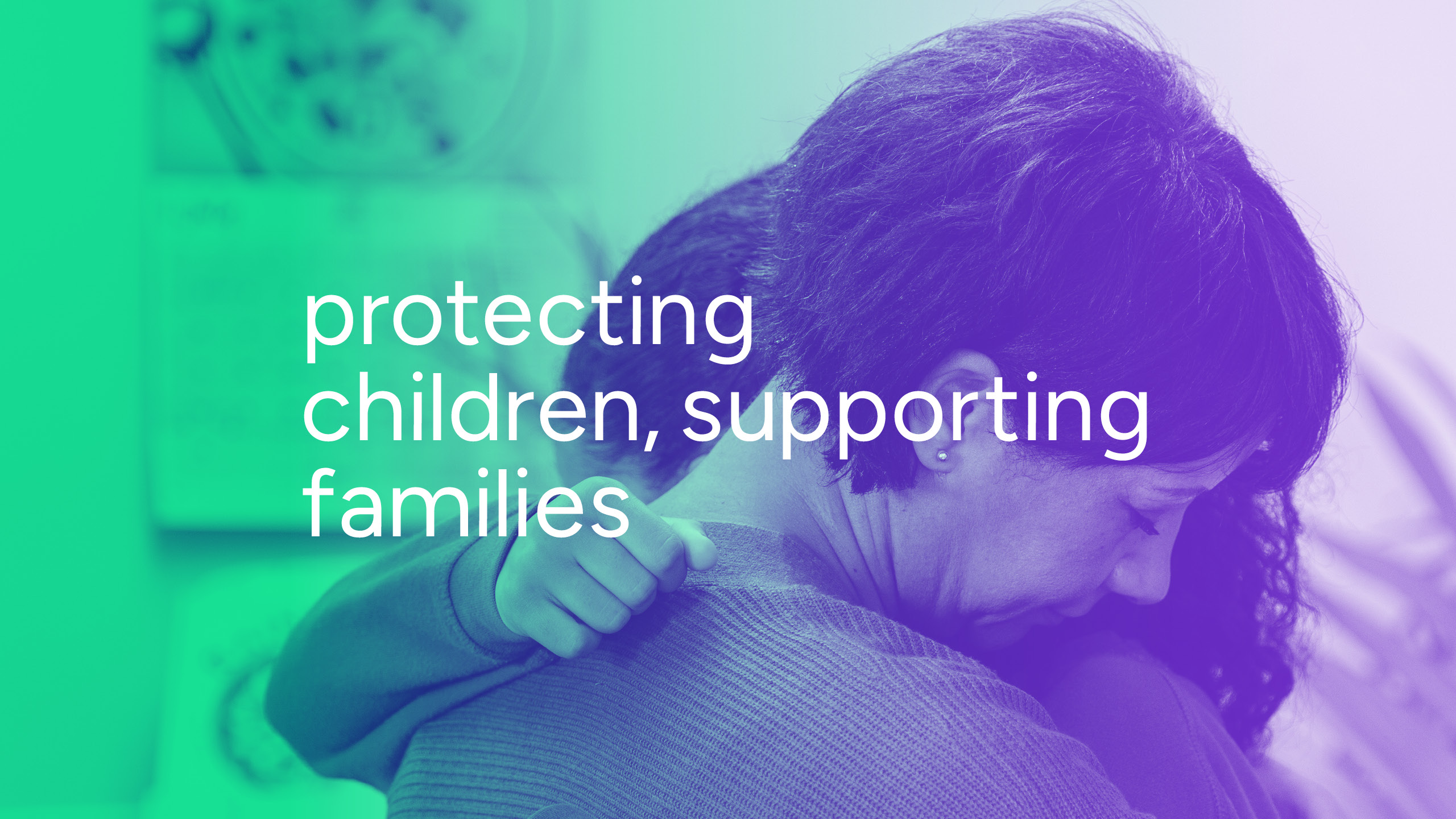
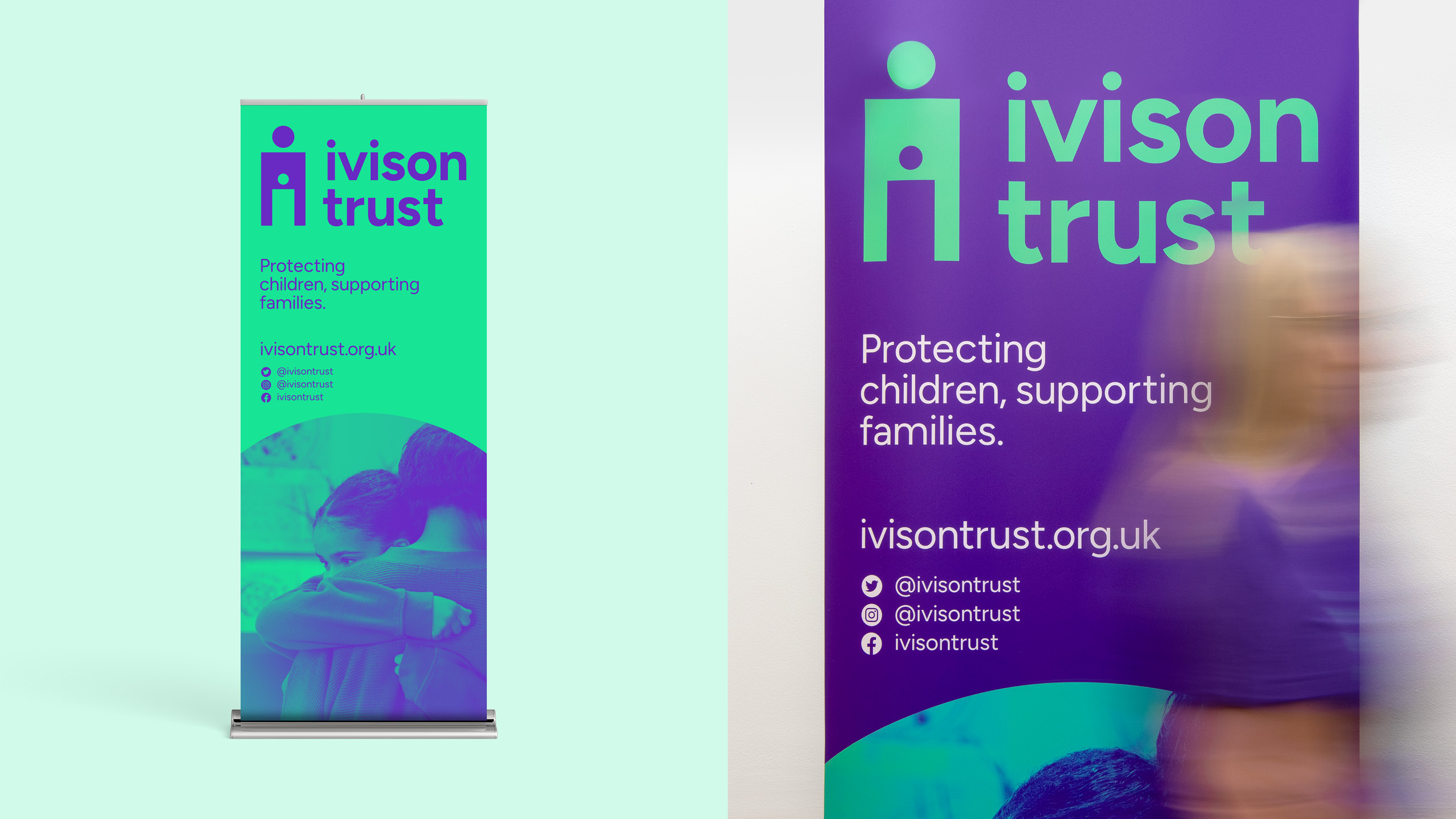
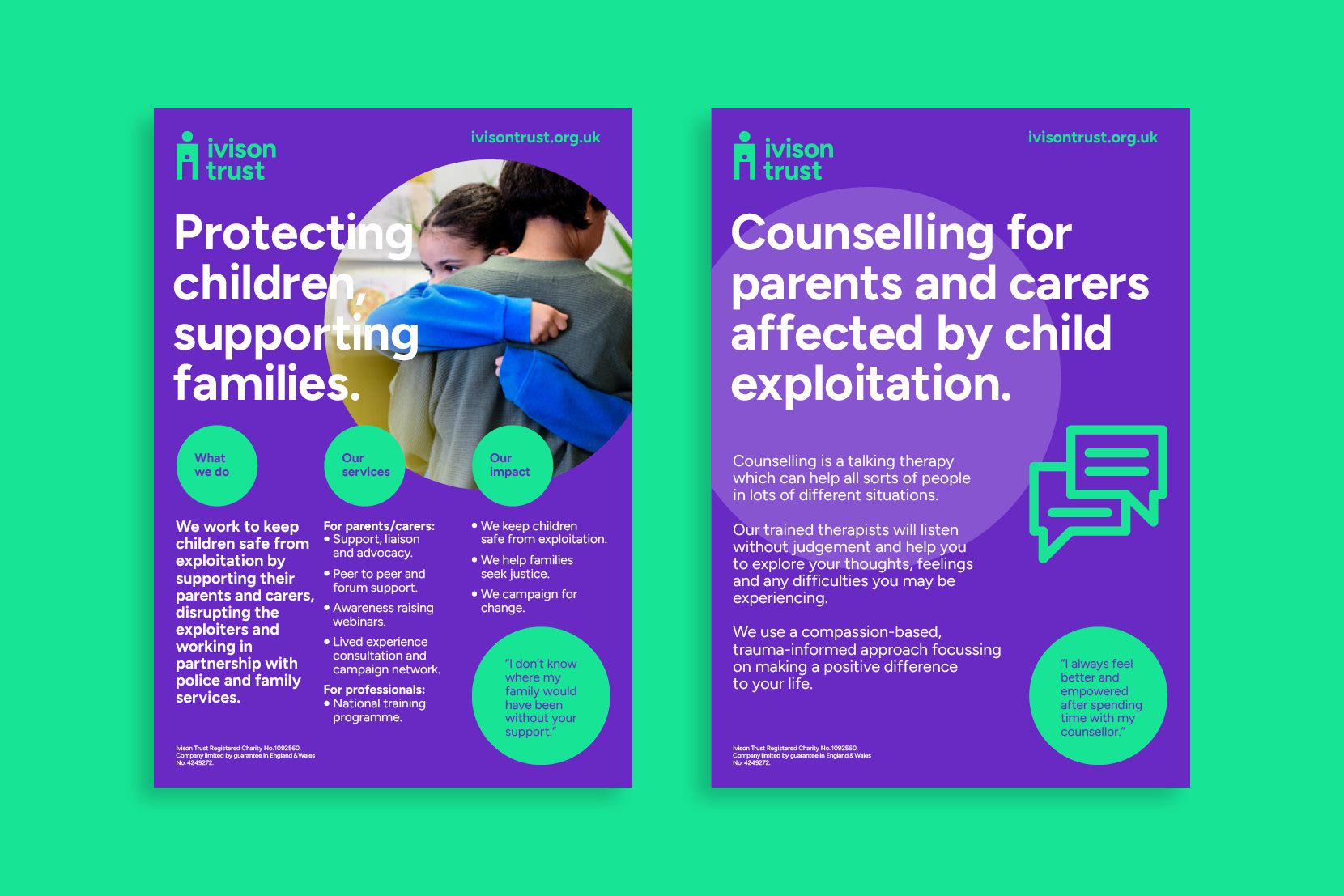
To work alongside the logo design we also developed a brand positioning for the charity, ‘Protecting children, supporting families’, to reflect the strength of parents and carers living with child exploitation and the critical need to protect every child from this form of abuse.
Brand guidelines:
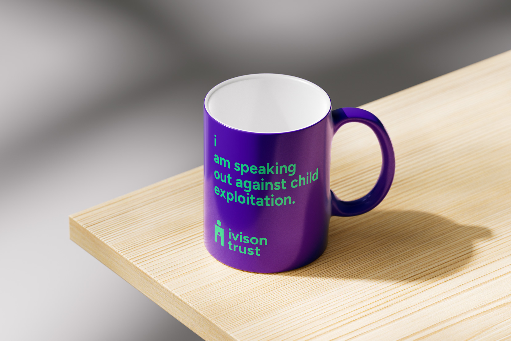
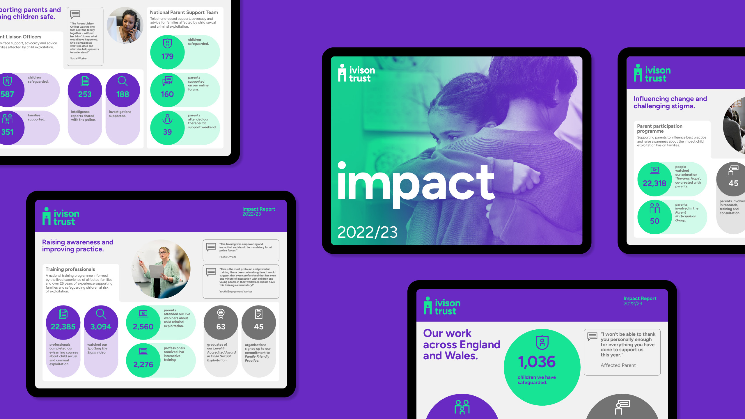
Design Project worked with Ivison Trust to ensure their ‘Empowering, Transformative and Inclusive’ brand values were integrated and expressed throughout their visual identity. We developed a vibrant and distinctive brand colour palette which focusses on purple and green, while a supportive grey coordinates and harmonises with the two primary colours.
By developing a branding guidebook for the charity, we incorporated all the elements needed to support the roll out of the visual identity as well as information to help maintain integrity and consistent application across all their marketing comms. The brand guidelines included every aspect – from logo usage and control, to colour palette, design elements and tone of voice – all which were accompanied by examples of branding in action to help model good practice.
Brand typeface:
The brand typeface we selected to compliment the logo design is Figtree – a font which brings unity across every marketing communication touchpoint. It is a geometric sans serif typeface which features a lowercase ‘i’ with a round dot – echoing the nature of the ‘double i’ monogram logo while also reflecting friendliness and humanity.
Brand icon set:
To help humanise and visually articulate factual information, we designed a set of branding icons to be used across all marketing communications. The icons are linear in style with a curved character to complement the logo design and typeface. When used in application they visually increase the accessibility of key information when displayed alongside written text.
Brand tone of voice:
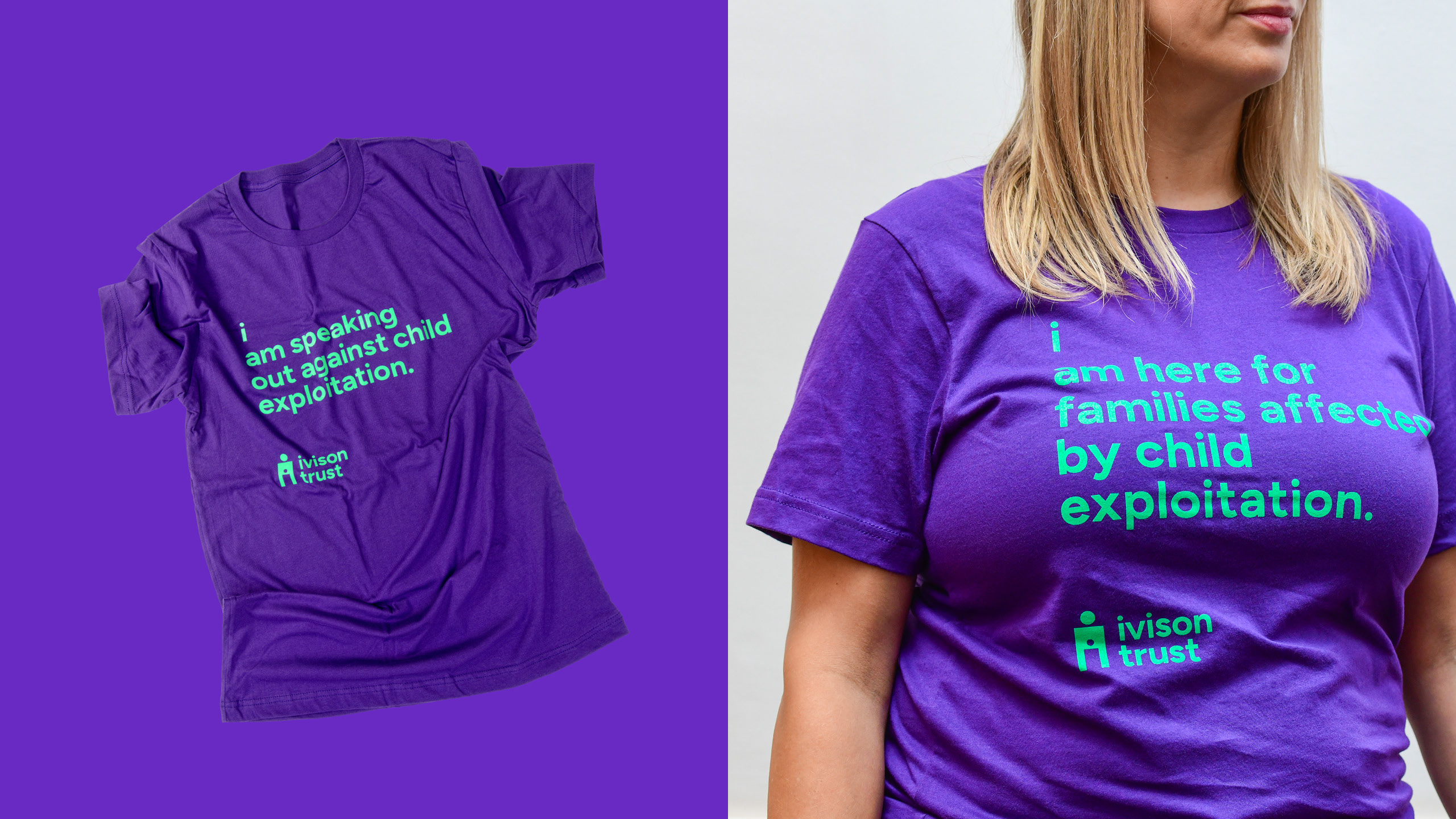
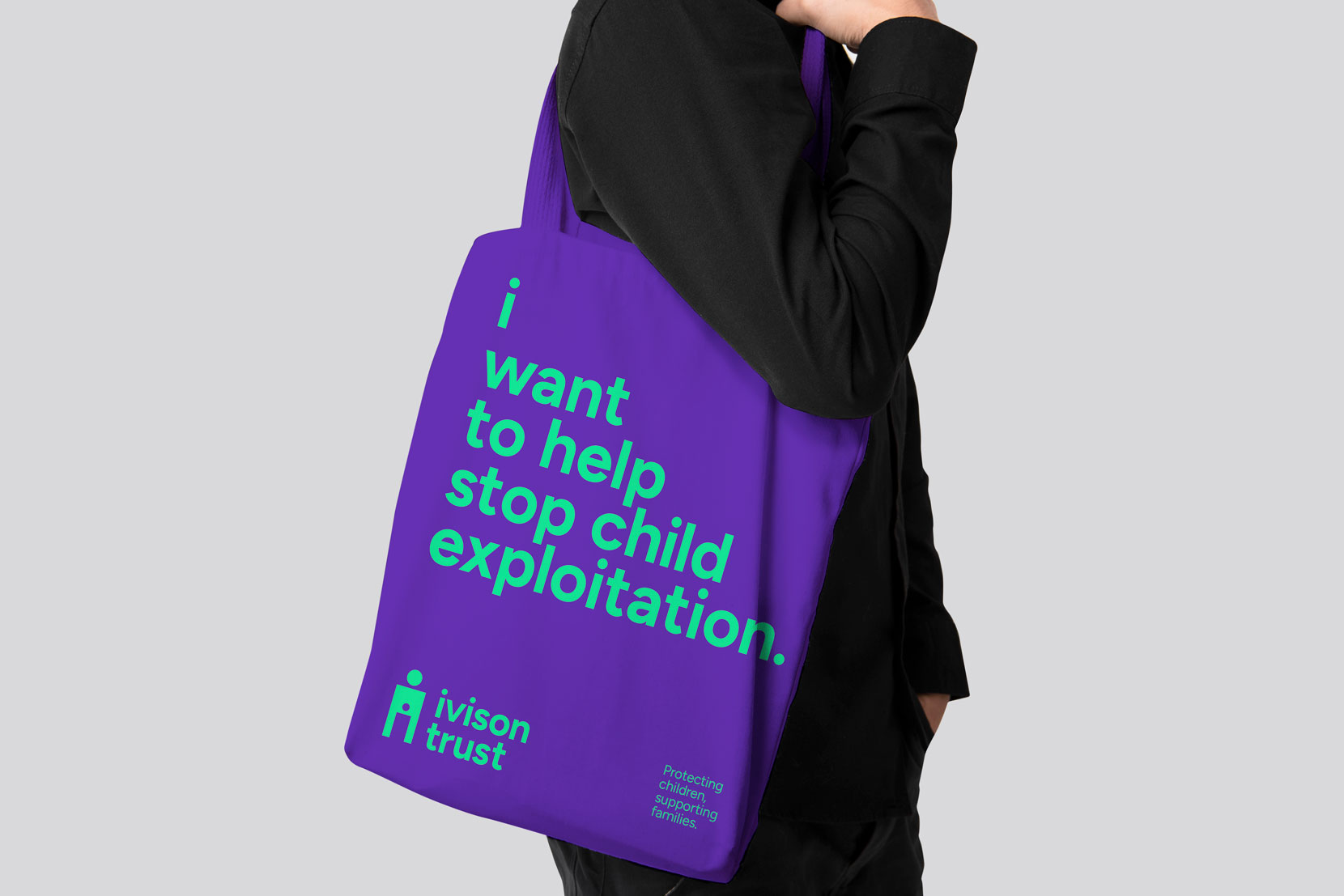
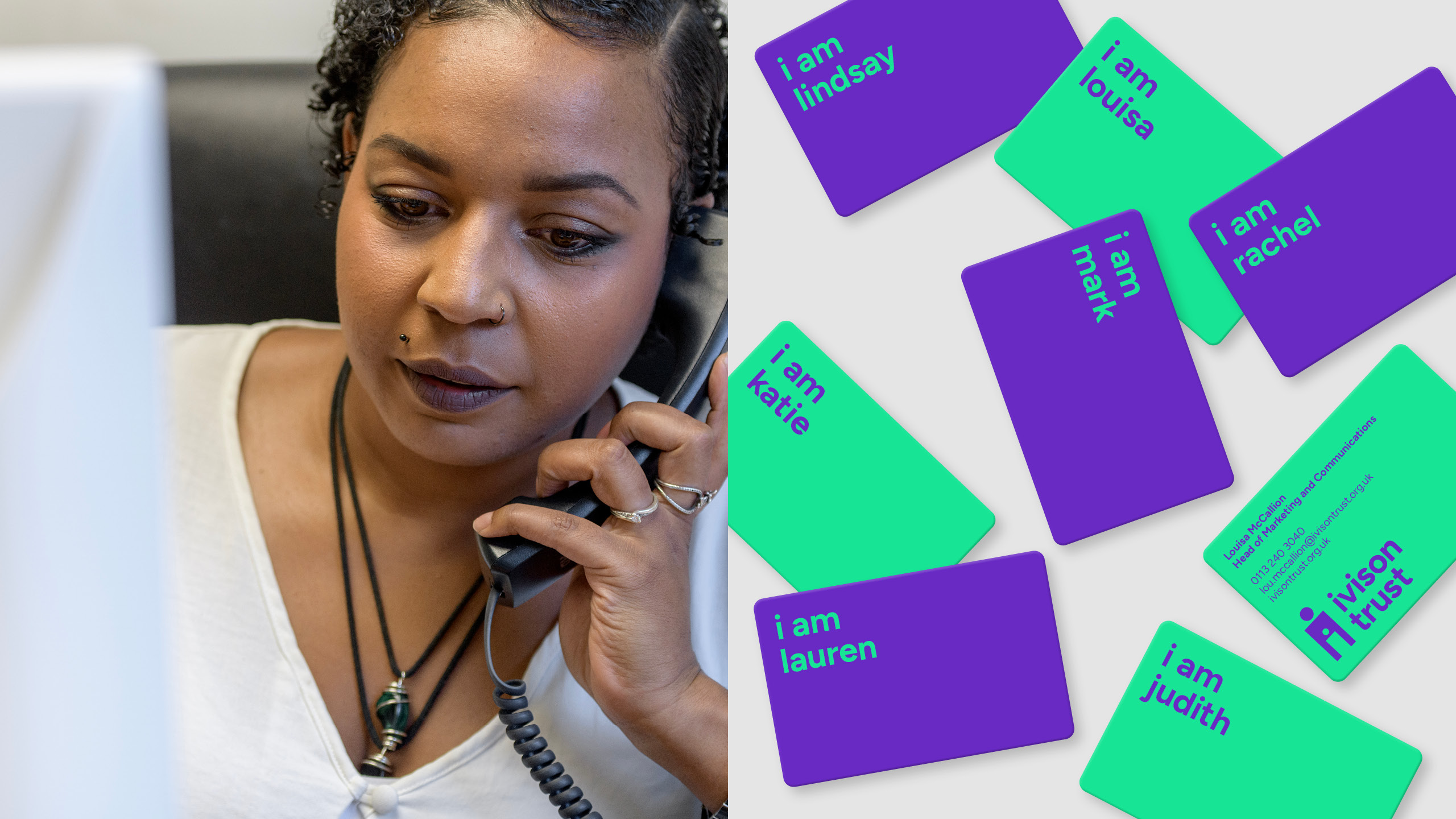
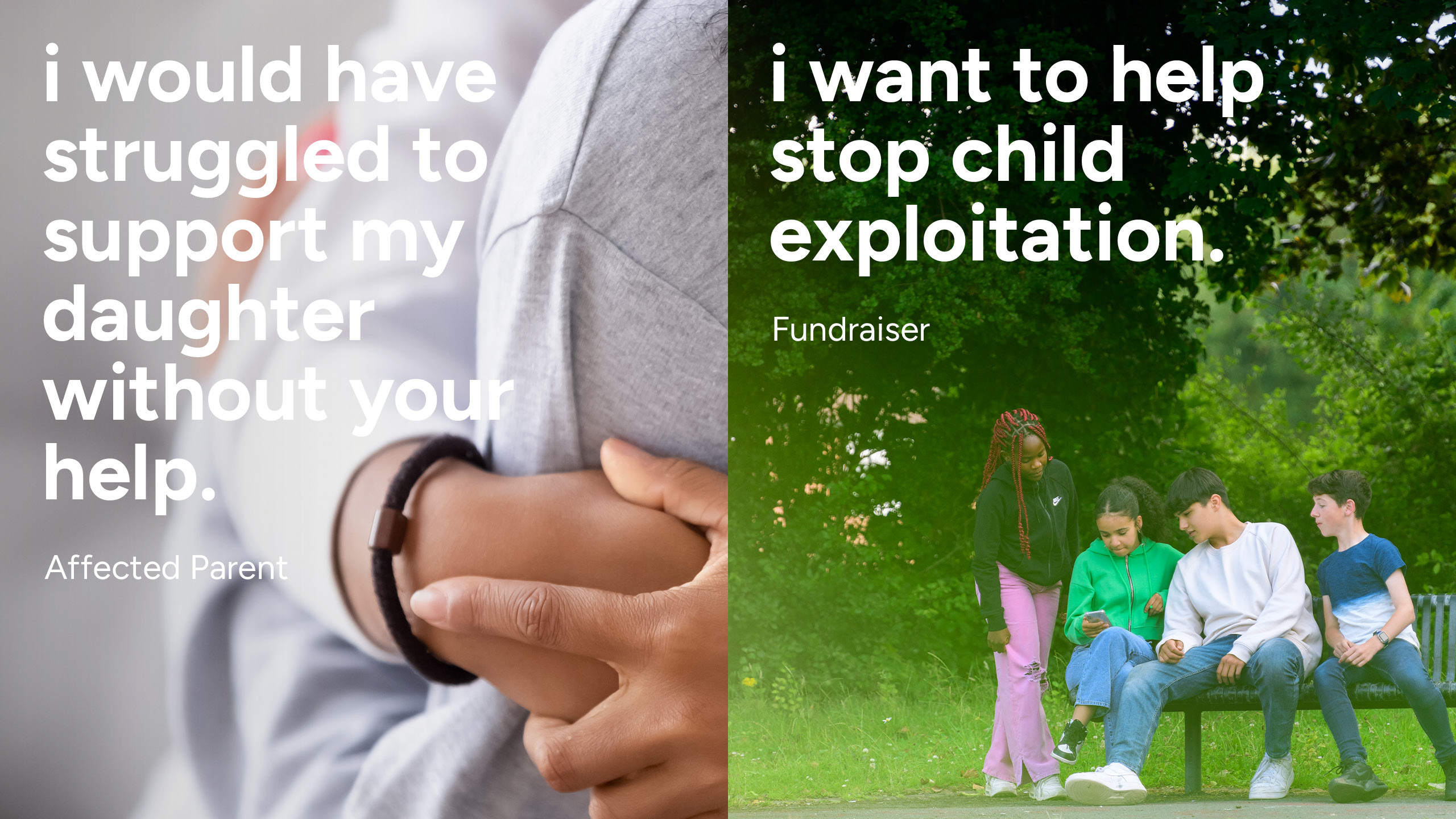
Design Project developed a brand tone of voice to enable the charity to engage and amplify their cause while also giving a supportive platform to those affected by exploitation. Using the lowercase ‘i’ branding device (derived from the logo design) enables the charity to articulate their voice in a more memorable and impactful way, while allowing those who they support to also be heard and empowered.
Marketing communications:
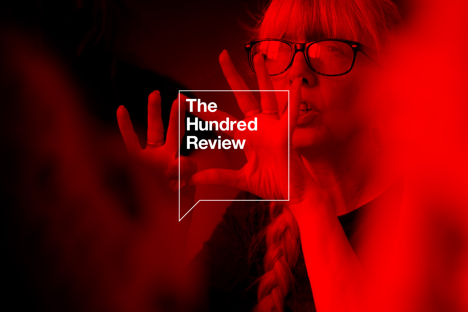
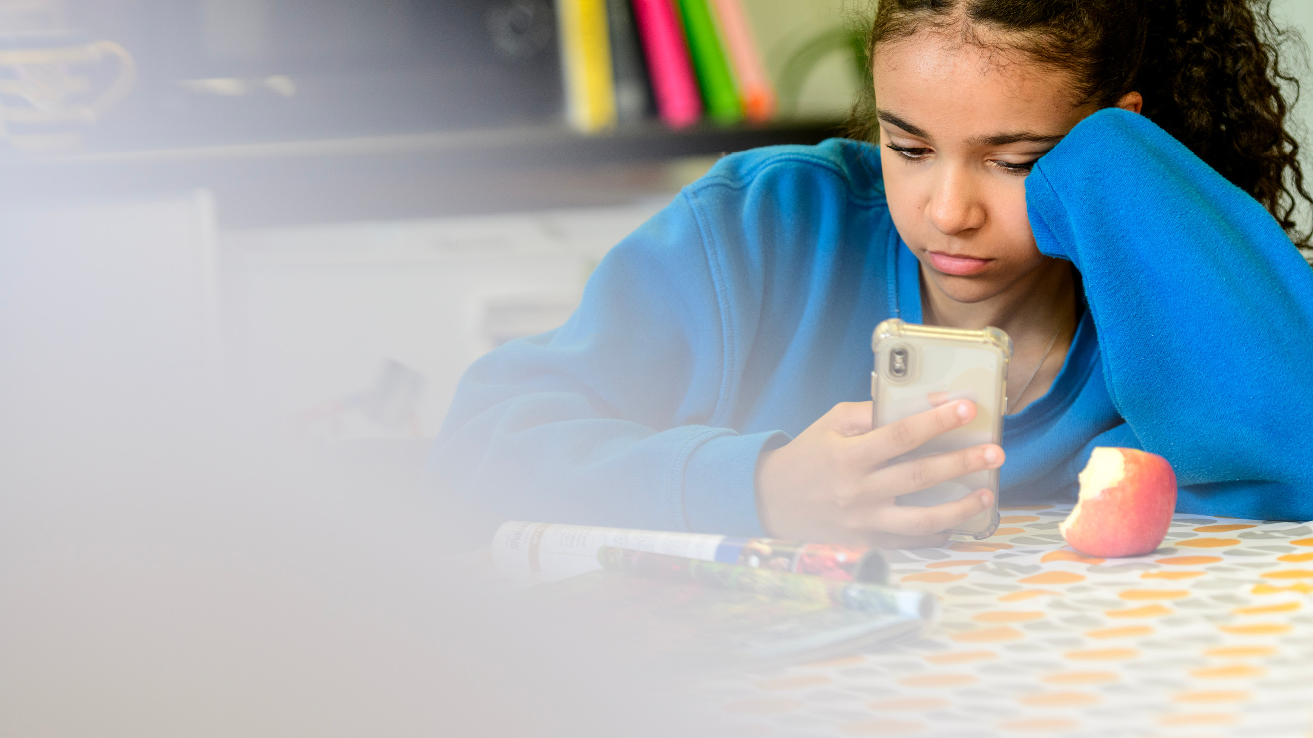
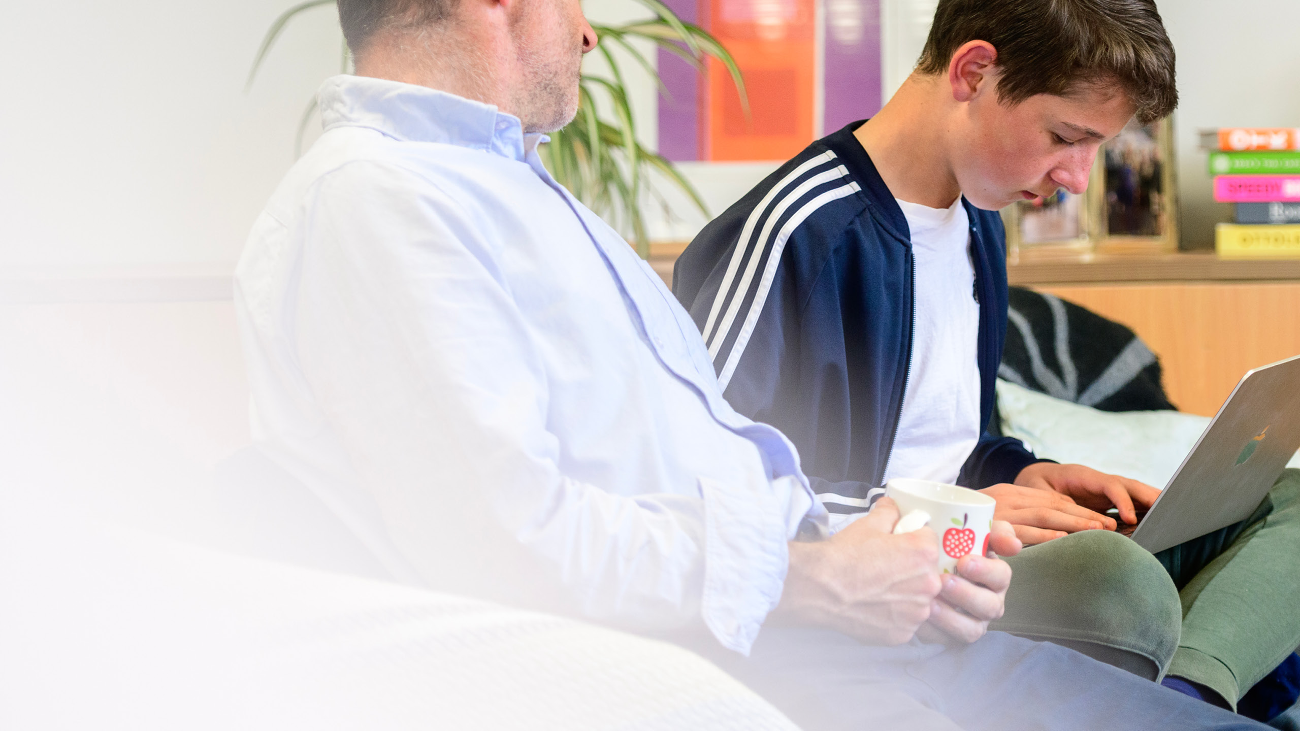
Bringing all elements of the Ivison Trust visual identity together creates a unique brand style for the organisation, both digitally and physically. A graphic circle device (derived from the logo) is used to dynamically reinforce key information in an impactful and engaging way. Brand icons are used to visually distil complex messages, and a unique custom image library enables the charity to further highlight their work and distinguish it from others in their field. Design Project also applied the new look and feel of the brand to their existing website, created marketing communications, and developed social media branding templates to help the charity cascade their messages with impact online.

Thank you so much for the work you have done in creating a brand identity we are proud of. There is so much emotion and history attached to our charity, and the fact you have been so thoughtful and open to discussion has been wonderful – you have been great to work with.
CEO, Ivison Trust